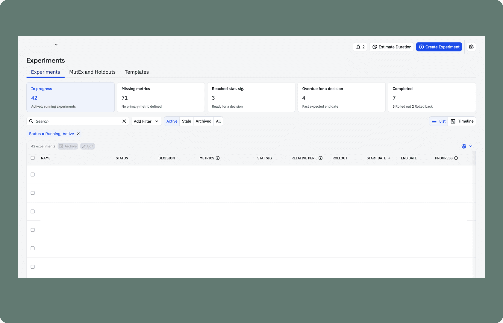
Experiment Filters
Redesigned Amplitude Experiments' top-level filters to help users more easily discover and act on important experiments
Challenges
Lacked affordance, leaving users unsure how to engage
Didn't follow familiar filtering patterns in Amplitude
Had weak visual hierarchy, making results hard to scan
Solution
Introduced hover interactions to improve affordance
Aligned with familiar filtering patterns from Amplitude Hubs
Applied design system components to refine visual hierarchy
Removed underutilized and confusing elements, like the "Requires attention" counter, timeframe dropdown, and pie chart
Impact
Increased weekly top-level filter usage by 50%
Increased individual filter usage for "In Progress" (2x), "Completed" (3x), and "Reached Stat Sig" (+70%)
Held custom filter usage steady, confirming the redesign didn't disrupt existing workflows
Before

After

Next project: